Handshake App Rewrites
As part of my final project for the UX Writing Fundamentals Course, I was tasked with rewriting multiple screens for a fictional app that handles payments between freelancers and business owners.
In addition to giving me plenty of
hands-on UX writing experience, this project let me flex my Figma muscles when it came time to mocking up the edits.
1. Welcome Screen

These first few edits are straightforward: I added some promotional copy that explains the function of the app as well as a friendlier, more collaborative CTA.
2. Sign In Screen

First, I flipped the options for creating a new account and signing into an existing account since that's the more common pattern found online. I also rewrote the password helper text to be more helpful and included a security tip (I would want to run this copy by legal since it talks about account security and financial information.)
3. Account Creation

I simplified the on-screen copy to a single question so the user knows exactly how to proceed. I also changed the labels for both user groups to terms they're more likely to identify with.
4. Creating a Job
(Business Owner)

+
I changed the word "project" to "job" so it's clear that there will be a financial transaction. I added some helper text in the form field underneath "Job details" to explain what sort of information the business owner should enter. I also wrote a tooltip to elaborate further and anticipate any questions they might have.
I also put on my designer hat and added a progress bar at the bottom of the screen.
5. Payment Method
(Business Owner)

I simplified the directions on this screen, corrected the capitalization in PayPal, and added "Direct deposit" as an option since it also appears in the freelancer flow in a few screens.
6. Invite Freelancers
(Business Owner)

I added more helper text explaining exactly what will happen after the business owner sends the email link to the freelancer. I changed the CTA to "Finish" so it's clear that this is the final screen of account setup.
7. Creating a Job
(Freelancer)

+
I added some helper copy outside of the rate form field so it's more obvious how the user should write the hourly rate. I also included helper text for the budget field as well as a tooltip explaining in greater detail. Since it's an important topic, I would recommend including a link to a blog post with even more tips on the matter.
8. Payment Method
(Freelancer)

Aside from changing the capitalization in "Direct deposit" to match the sentence case in the rest of the app's copy, the changes here are identical to the business owner flow.
9. Invite Client
(Freelancer)

The changes here are similar to the changes made in the business owner flow.
10. Confirmation
(Both)

I had to rewrite this screen to be more clear on the benefit of creating an account in a way that made sense to BOTH audiences. I also added a CTA that mirrored the CTA on the very first screen.
11. Jobs Screen
(Business Owner)
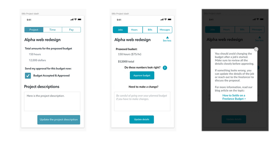
+
This screen is filled with important information, so I had a lot to cover in my edits.
Although I tried writing within the confines of the design as much as I could, I think it's important for a UX writer to add ideas on how they think the design can be improved. I suggested adding a collapse arrow next to each job in case the client has multiple and changing the "Approve budget" CTA to a clear button.
I rewrote the text above the CTA to remind the user to review the budget and I included a tooltip with more information, similar to the budget tooltip in the freelancer flow.
I also rewrote the copy above and in the bottom form field so it's more obvious what its purpose is.
12. Hours Screen
(Business Owner)

I streamlined the upper copy so there aren't as many headings to skim through. I also suggested arranging the weekly summary window horizontally to fit more in line with a calendar view like most time tracking software.
13. Bills Screen
(Business Owner)

My edits on this screen were directed toward the design more than copy. I added a dropdown menu to account for any users who might have multiple jobs. I changed the message CTA to a tab on the navigation menu. I also added a visual indicator for how much of their budget the business owner has spent.
14. Payment Confirmation
(Business Owner)
Because sending payments can be a very serious and stressful touch point for users, I pared down the text to be absolutely clear what action the user was about to take.
15. Jobs Screen
(Freelancer)

I altered the design here to make it more clear what actions the user can take on this screen. I also added collapsible arrows to account for freelancers who have multiple jobs.
16. Job Details
(Freelancer)

For the details pop-up, I just changed the header to use consistent terminology with the rest of the app.
17. Hours Screen
(Freelancer)

I added two CTA lines under the Submit CTA: one for adding hours to another job in case the user has multiple and another for adding hours for a previous week in case they entered them incorrectly or missed a week.
18. Pay Screen
(Freelancer)

On this screen, I simplified the view to display bills that are ready to send and bills that have already been sent. I added an Edit button to bills ready to send in case there was any input error. For sent bills, I added in copy to indicate when the bill was paid. If the bill is unpaid, I added a link to send a reminder to help advocate for the freelancer as well as a cancel button in case there was any input error there as well.
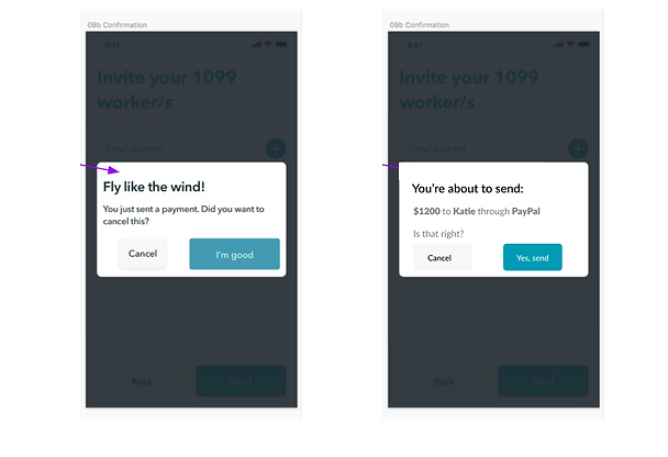
19. Cancel Confirmation
(Freelancer)

I rewrote the confirmation screen to be shorter and easier to understand. I explained what happens after a bill is cancelled and how the user should proceed. Since the action the user wants to take is "Cancel," I rewrote the buttons to be more direct so the user knows which button will give them the result they want.
20. Bill Send Confirmation
(Freelancer)

Similar to the cancel confirmation screen, I rewrote the bill send confirmation to be more explicit about what the user can expect to happen next.