CardMatch Question Flow
CardMatch is a feature on Bankrate that shows users personalized recommendations for credit cards. We were tasked with revamping the flow to reorder the questions and make it more personable to increase CTR.
OLD:

The old version of CardMatch immediately asks the user for a bunch of personal information without explaining why they should do so. It felt less like a personalized search and more like an interrogation.
UPDATED:

The updated flow opens with a question that feels less personal and more intentional.

(This question will appear for users who chose "Getting cash back")
The opening portion was designed from scratch to center around the user's credit card habits. These questions are easier to answer and show that the tool will find cards that best match their preferences.

(This question will appear for users who chose "Saving money on interest")
We included relevant tooltips under certain questions to help build trust and give the user more context to inform their answer.

Annual fees tend to be the biggest hurdle for most people when looking for a new card. We wrote a tooltip that gave a range of what the cost would be and explained that the value of the card can outweigh that cost. We included an "I'm not sure" option for users who could be swayed either way.

One of the biggest changes from the prior design was chunking out the flow into 3 sections. We took this approach to solve for 3 objectives:
-
Restructure the flow so the personal questions come last
-
Give the user a sense of progression with reassuring messaging
-
Explain what the focus of each set of questions is so it feels less abrupt
OLD:

The prior design asked personal finance questions without explaining why they were necessary. Without the context of the headline, there's no indication that this is a tool for finding a credit card.
UPDATED:

The updated flow always gives the "why" behind sensitive questions. Users could drop off at any point, so we wanted to let them know that their answers will help them find their matches.
OLD:

UPDATED:

OLD:

UPDATED:


We deliberately positioned the personal information questions last since this is where we saw the most drop-off in the prior design. We explained to the user that these questions were for verifying their identity so they understand we're not trying to collect their personal data for malicious reasons.
OLD:

UPDATED:

We used the name question in the updated flow to inject some personality and to come off as more human to the user.
OLD:

UPDATED:

OLD:

UPDATED:

OLD:

The business driver of CardMatch is to collect emails, so we can't avoid this step. We can give the user more information, however (instead of burying the benefit in what looks like legal text).
UPDATED:
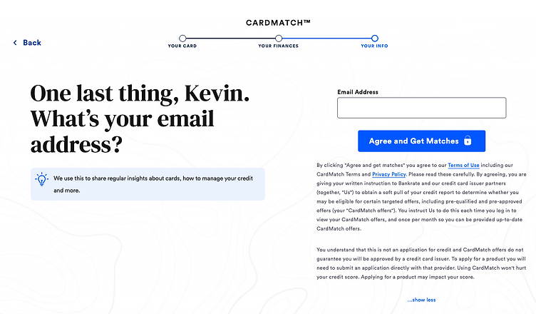
We list the benefit of sharing your email in the tooltip to encourage users. We also clarify in the question that this is the final step.

OLD:

The prior results page put a greater emphasis on our partners and displays the results in a list view with a list of filters in the margin.
UPDATED:

We redesigned the results screen to focus less on the partners and more on the user's personalized results. We highlighted the top result more so it felt like the best offer. We also removed the filters so the results read more as personalized recommendations instead of another page for the user to manually search through.
RESULTS:
The redesigned flow was exposed to a smaller audience than the control, but form completion rates approached parity within a month of launch.
Each step of the updated flow saw completion rates over 90%.