BankMatch
In 2022, Bankrate created a product to help people find quality high-yield savings accounts. This tool came to be known as BankMatch.
I supported content efforts from conception to launch, eventually becoming the lead content designer on the project.
PART ONE:
Untitled Savings Product
We didn't have a product or a name in the very beginning. All we had was a FigJam loaded with a ton of sticky notes and an empty Figma board of dreams. As we started the design process, we launched a smokescreen promoting the idea to start gathering leads from prospective savers.
The communication objectives for this new product were threefold:
1. Show people how they could be saving exponentially more if they switch from a brick and mortar bank
2. Overcome the misconception that online accounts are less reputable or trustworthy
3. Position our new tool as the solution for people who don't want to bother with the hassle of finding and switching banks


Legal disclaimers would continue to evolve throughout development. I had to work closely with our compliance team in this effort to ensure we weren't misrepresenting what the product offered.


One of the consistent value props we used was positioning the potential earnings of the banks in our program against the national savings average.
Aside from being a complicated comparison to explain in a short space, we would soon learn that it added to confusion over whether this was a bank search tool or a bank in itself. We continued to iterate on this language to make the distinction more clear.
PART TWO:
The Wireframes Formerly Known as Amplify
Once the smokescreen was live, we changed gears to building the actual product. After collaborating with the product management team and business leaders, we landed on
low-fidelity designs to test. These wireframes showed the user journey through a questionnaire that would end with their results for recommended savings accounts.
Onboarding screen:
Normally the user would reach the questionnaire from a landing page. We didn't have a page yet, so we made a brief (or what we thought was brief) explainer of the product before the user starts the question flow.
As most writers can tell you, naming products and features is hard. After much brainstorming as a group, we thought we had landed on Amplify. It was a strong action verb that evoked the idea of boosting your savings, and we thought it was clever how it contained the letters APY as a hidden nod to what the product was about.


We set up the problem and offered a solution through the product features to get users excited before we ask them about their banking preferences. We used emoji and a light-hearted tone to position this tool as a modern alternative to stuffy brick and mortar banks.
Questionnaire:
Since the answers would inform the user's results, it was essential they understood what was being asked of them and felt comfortable sharing information about a sensitive topic like finances. We also used the questionnaire to inject some more branded touchpoints to build trust.
We utilized the left margin to ask the question and explain more about how the product works. User testing told us that this treatment led to the question overpowering the answers, however. Most users during testing weren't sure where to look first.


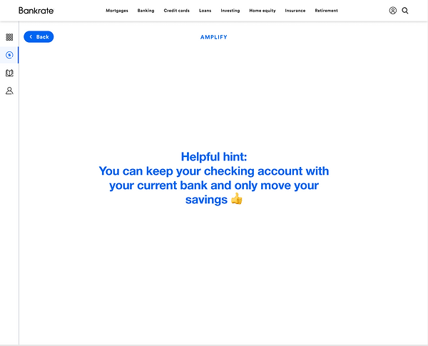
We felt it was important to emphasize to users that they didn't have to give up their current bank. We showed this message in between questions so they couldn't miss it. This created a pattern of interruptions, though. Most users during testing felt the flow took too long to complete.


Results page:
In these early wireframes, we only highlighted the user's top result once they finished the questions. We felt this would offer them more guidance and reassurance that the account they're seeing is truly their best fit. From here, the user would proceed to the bank's site to open an account.
After discussing with the product and engineering team, we realized the matching criteria couldn't be quantified as a percentage. The language under "Your top result" would change in the next iteration.

The idea of Amplify is that every bank we recommend has been vetted and offers a great experience. We still highlight the rest of the banks even if they aren't the user's top result. That's why we chose the heading "All the great rates Amplify can offer."
PART THREE:
The Rise of BankMatch
Once user testing was complete, we went through another few rounds of iterations. Perhaps the most impactful change was moving away from Amplify, a name that didn't particularly resonate with users, to BankMatch. This simpler name explained what the product did and helped alleviate the confusion around whether it was an online bank or a search tool.
New landing page:
We took user feedback from the original smokescreen test to create a new landing page for the launch of BankMatch. This new version streamlined most of the content, embraced a more upbeat tone, and introduced a new illustration style to highlight the product.


Many rounds of revisions led to this final subheader describing what BankMatch is to new users. Instead of leading with the problem of saving less with traditional banks, we led with the benefit of earning 14x more.
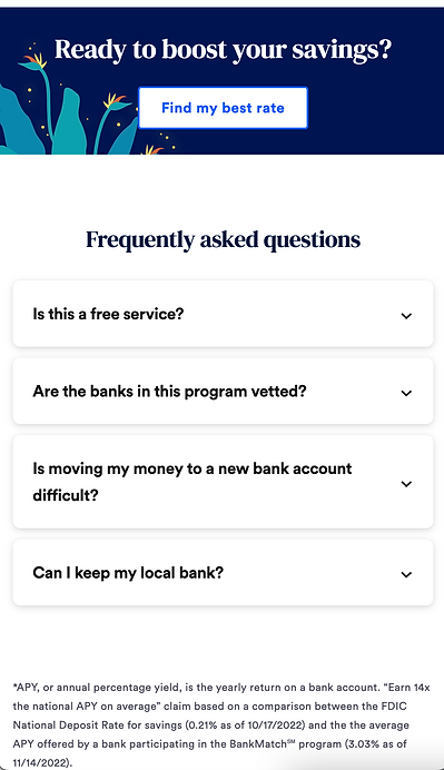
(FAQ answers expanded)
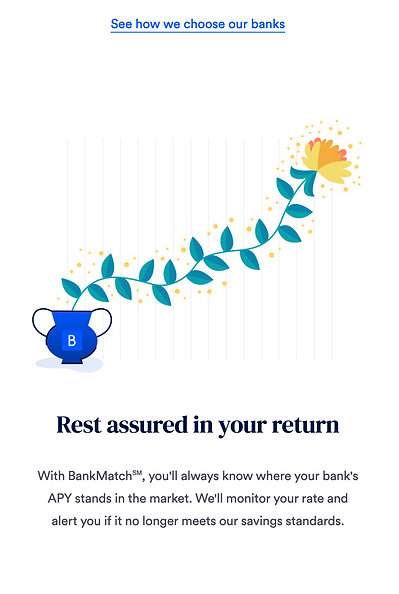
We landed on these 3 factors as the main value props of banks vetted by BankMatch.
Questionnaire:
The question flow received a serious overhaul after user testing. We streamlined the flow by removing the lengthy onboarding screen and interstitials between questions, simplifying helper text throughout, and eliminating redundant questions or those that wouldn't impact the results.
Overall, users weren't too keen on the playful tone we used in the wireframes shown in testing. One of the users referred to the tone and emojis as "kindergarten" (ouch). For the final design we opted for a more straightforward (but still uplifting) tone.


Results page:
Users reported wanting to see more than one top result, so we highlighted three in the final design. We also highlighted the methodology of BankMatch to build trust in our vetting process.


If the user browses past their top results, they'll see highlights of our methodology. We included this section as a final touchpoint to build trust when the user is most ready to open a new account.


The user can still see the rest of the banks in our program under "Other great options." The final design is meant to steer them to the top 3 results based on their answers, however.
Methodology page:
If the user wants to learn more about how we vet the banks in our program and the exact criteria we check, they can view the full methodology page.


Creating the content for this page meant collaborating with product, business ops, and compliance to capture all of their input. From there, the challenge was synthesizing it all and simplifying the language so that the page was actually useful.


RESULTS:
Originally, this section was much more granular since we had an entire monitoring journey mapped out for users notifying them if their bank no longer met our requirements. We ended up scaling that feature back for MVP. Instead, we agreed to create ad hoc emails in the rare instance where a bank would fall out of the program. With this new direction, we didn't have specific scenarios for what would prompt an email. We wanted to be as specific as we could, however, to set expectations and show the value of BankMatch after opening a new account.
In the first 30 days….
-
1400 people started the BankMatch flow
-
62% of people who visited the landing page started the process
-
42% of those users completed the flow
-
There were 150 product clicks from users who made it to the results screen
-
From the landing page to results screen, we saw a 10% CTR